Apple Music unveils new logo shaped by sound
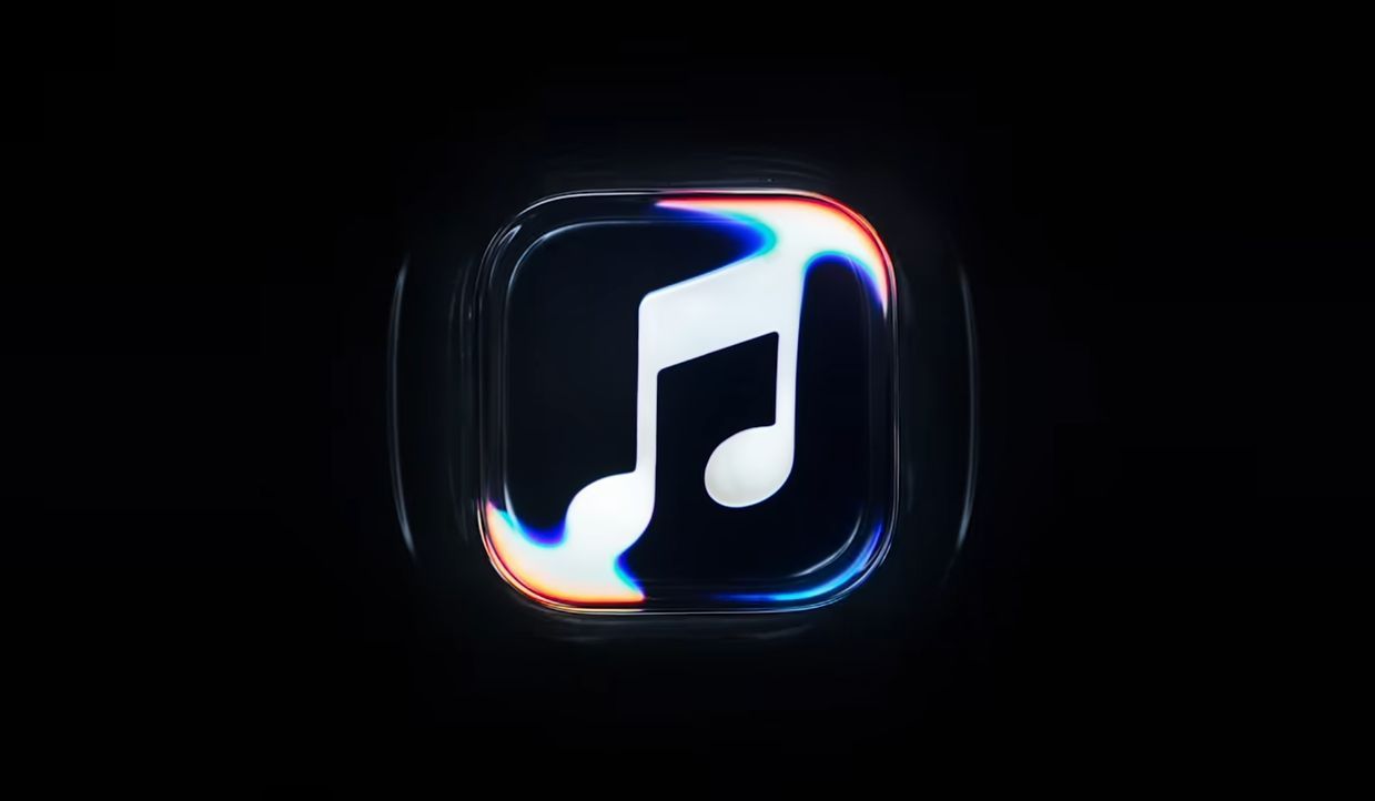
The refreshed identity includes a redesigned Apple Music app icon featuring a black-and-white color scheme, replacing its familiar red appearance. The broader branding also incorporates liquid-inspired visual effects and an updated wordmark based on a customized version of Apple's SF Pro typeface, complementing the company's Liquid Glass design language.
-
Courtesy of Apple
Unveiled on October 21, the rebranding centers on the concept of “Made by Sound,” bringing together music, visual design, and sound technology to create a new identity for Apple's music streaming platform.
Unlike traditional logo redesigns, Apple used actual sound vibrations to produce the visual effects behind its new branding.
In a behind-the-scenes video, Apple demonstrated how musical frequencies were transmitted through liquid, creating ripples and movements that transformed the appearance of the Apple Music logo and wordmark.
The resulting visuals were captured on camera, allowing the company to develop a design directly influenced by sound rather than relying entirely on digital animation.
The project involved Fred again.. and NEST Acoustics, who collaborated on an original musical composition that also serves as Apple Music's new audio signature. The refreshed identity includes a redesigned Apple Music app icon featuring a black-and-white color scheme, replacing its familiar red appearance. The broader branding also incorporates liquid-inspired visual effects and an updated wordmark based on a customized version of Apple's SF Pro typeface, complementing the company's Liquid Glass design language.
Key points
- The refreshed identity includes a redesigned Apple Music app icon featuring a black-and-white color scheme, replacing its familiar red appearance. The broader branding also incorporates liquid-inspired visual effects and an updated wordmark based on a customized version of Apple's SF Pro typeface, complementing the company's Liquid Glass design language.